Clinics buy patient apps on the feature list. Patients use a fraction of it.
Both halves of that sentence are supported by evidence, and holding them together is the whole design problem. Apps do change IVF outcomes. They change them through a narrow set of moments, and most of what gets demonstrated in a procurement meeting is not among them.
The evidence that apps change outcomes
Start with the part that justifies the investment, because it is real.
An observational cohort study of MediEmo — a fertility app built around emotional wellbeing and medication adherence — found that patients who used it were more likely to have a live birth after their first IVF cycle, and more likely to return for further treatment after an unsuccessful cycle, compared with patients who did not. Engagement was high, and it concentrated particularly on the medication timeline (PMC).
Two things in that finding are worth separating.
The live-birth association is the headline, but the mechanism is not mysterious and it is not clinical. An app does not improve embryo quality. It improves whether the right dose was taken at the right time, and whether the patient understood what was happening well enough to keep going.
The return-after-failure finding is arguably the more important one commercially, and it is the one clinics rarely model. A patient who does not come back after an unsuccessful first cycle is a clinical outcome and a business outcome at the same time. Anything that raises continuation is working on both.
That aligns with what we see in deployment. Across live Meddilink deployments, MedX delivers up to a 25 to 40% reduction in missed medication doses and up to a 60% reduction in appointment no-shows, through cycle-aware reminders in the patient’s own language. Those are the operational numbers underneath the same mechanism.
Liked and unopened
Now the half that procurement never hears.
A 2025 mixed-methods evaluation published in JMIR Human Factors studied a preconception lifestyle app used by couples undergoing IVF. It reported good acceptability and positive user experience alongside low actual objective use (JMIR Human Factors). Patients said they liked it. The logs said they were not opening it.
That gap is not a contradiction, and it is not patients being unreliable. Satisfaction and use answer different questions:
- “Do you like this feature?” asks whether it should exist. Almost every reasonable feature clears that bar. Nobody objects to a nutrition library.
- “Did you open it on day 7 of stimulation?” asks whether it helped right now. Very few features clear that one.
Clinics that evaluate patient apps on satisfaction scores will systematically overestimate what is in use — and will keep paying for surface area nobody touches. Worse, they will conclude the app is working while the numbers that were supposed to move stay flat.
The JMIR authors’ own recommendation is the useful part: to raise engagement, focus on personalisation and on interaction with providers and other patient data systems. In other words, the fix for low use is not more features. It is tighter connection to the patient’s actual treatment.
Proximity to consequence is the design principle
If you line up what holds attention against what does not, one variable explains most of it: how close the feature sits to something the patient has to get right today.
Medication timing is the clearest case, and it is where both the MediEmo engagement and our own deployment numbers concentrate. A stimulation protocol involves injections at specific times, doses that change mid-cycle, and consequences for getting it wrong that the patient understands perfectly well. An app that answers what do I take, how much, when is answering a question being asked daily under pressure.
Results and appointments follow the same logic. A patient waiting on an oestradiol level or a fertilisation report is going to find out somehow — from the app, or by phoning the clinic. Those are the same event from the patient’s side and very different events from the front desk’s.
Wellness content, education libraries and community features sit furthest from consequence. This is not an argument that they are worthless; the MediEmo app was explicitly built around emotional wellbeing and it performed. It is an argument that they do not carry engagement. They are used by patients who are already opening the app for something else.
Which yields a sequencing rule worth stating plainly: build the consequential path first and let everything else attach to it. An app whose medication and results flow is excellent will get its education content read. An app whose education content is excellent and whose dose schedule is a static PDF will not.
Anxiety cuts both ways
Engagement design in fertility care runs into something most patient-app thinking ignores: the user is frightened.
Psychological distress is disproportionately common among patients with infertility and is a recognised contributor to treatment discontinuation. That reframes what the app is for. It is not a satisfaction instrument. It is a retention instrument, and the mechanism is anxiety reduction.
The implication is counter-intuitive for anyone measuring engagement as activity. More notifications is usually worse. Every non-essential message competes for attention with the small number that genuinely matter, and for an anxious patient a notification is not neutral — it is a small alarm that resolves into nothing. Volume trains people to stop looking.
The better test for any patient-facing message is: was the patient about to ask someone this? If yes, the app has removed an anxious phone call and a front-desk interruption in one action. If no, it has added noise to somebody already carrying too much.
Access is part of the same problem. A patient who cannot read the app in their first language is not a low-engagement user; they are an excluded one — and in cross-border markets like the Gulf and Southeast Asia, that describes a large share of the caseload. MedX delivers cycle-aware reminders in the patient’s own language, and MedXbot handles the questions that arrive outside clinic hours across website, WhatsApp and Messenger in 90+ languages, with handoff to staff when a question needs a person. Between them, the aim is the same: fewer questions the patient has to hold onto until Monday.
Designing around the cycle, not the org chart
Most patient apps are organised the way the clinic is organised — a section for appointments, a section for billing, a section for documents, a section for messages. That maps the org chart onto the patient’s screen.
The patient is not living in departments. They are living in a cycle, and their question is almost always some version of where am I, and what happens next.
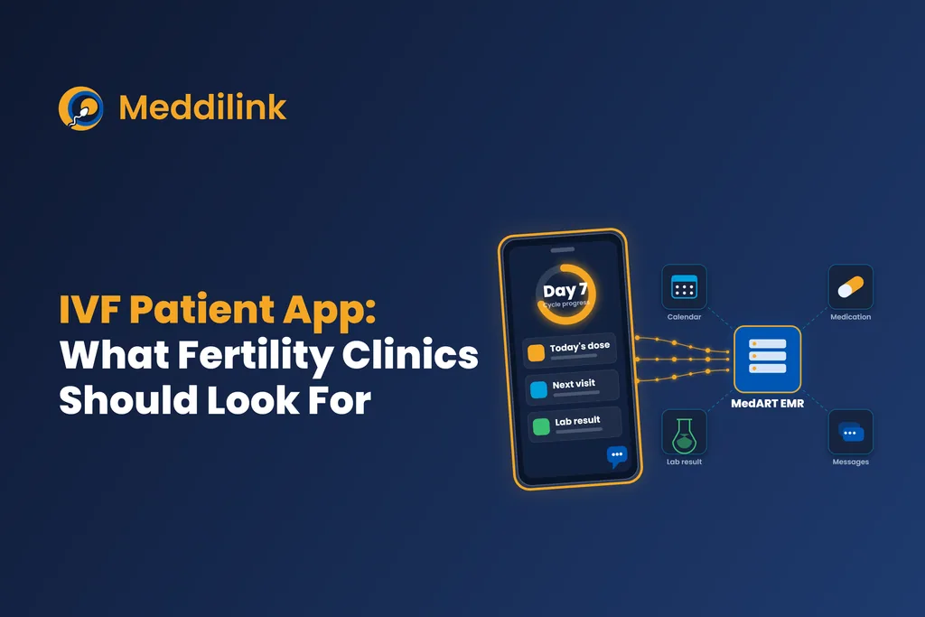
An app built around that shows the patient their position — day 6 of stimulation, next scan Thursday, dose unchanged — and lets everything else hang off it. The difference is not cosmetic. A patient who can see where they are asks fewer questions, and the questions they do ask are better ones.
This is also where standalone apps hit a ceiling that no amount of design solves. If the app does not know the dose changed this morning, it cannot tell the patient, and the patient finds out by phone or not at all. The JMIR conclusion pointed exactly here: integration with providers and clinical data systems is what raises use. MedX runs against the same record as the clinic’s MedART workflow, so a dose adjustment made in the consultation is what the patient sees, without anyone re-entering it.
What this means for a clinic evaluating an app
Three adjustments, each following from the evidence above.
Evaluate the consequential path, not the feature count. In a demo, ask to see a mid-cycle dose change: how it is entered clinically, how it reaches the patient, and how quickly. That single flow predicts more about adoption than the rest of the walkthrough.
Do not accept satisfaction data as usage data. Ask what proportion of patients open the app during an active cycle, and how often. If the answer is a download figure or an app-store rating, it is not an answer.
Measure operational consequences, not logins. Missed and mistimed doses, no-show rate, inbound call volume for questions the app already answers. These move when the app is being used for what matters, and they stay flat when it is being downloaded and abandoned.
The uncomfortable version of all this is that most patient-app value sits in three or four screens, and most patient-app spend does not. Knowing which three is the entire exercise.
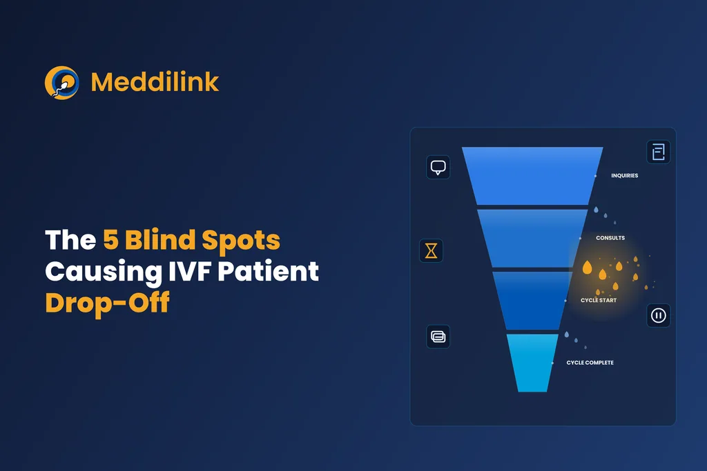
For the wider picture of where patients disengage across the whole journey, see the blind spots causing IVF patient drop-off. If you are at the selection stage, what to evaluate in an IVF patient app covers the criteria in more depth.
Topics

Product Head — MedART
Preeti Pamecha is Product Head for MedART, the purpose-built IVF EMR platform powering fertility clinics across 25+ countries. She leads the product roadmap across MedART's 17+ modules — clinical documentation, embryology, andrology, laboratory, billing, patient-360, analytics, and beyond — translating how IVF care actually happens on the ground into what the platform does next. She works closely with fertility clinic leaders, embryologists, and lab directors to make sure every release reflects real clinic workflows, not assumptions about them.